/ / Bug Report / /
*
I will update this post with all the bugs I find.
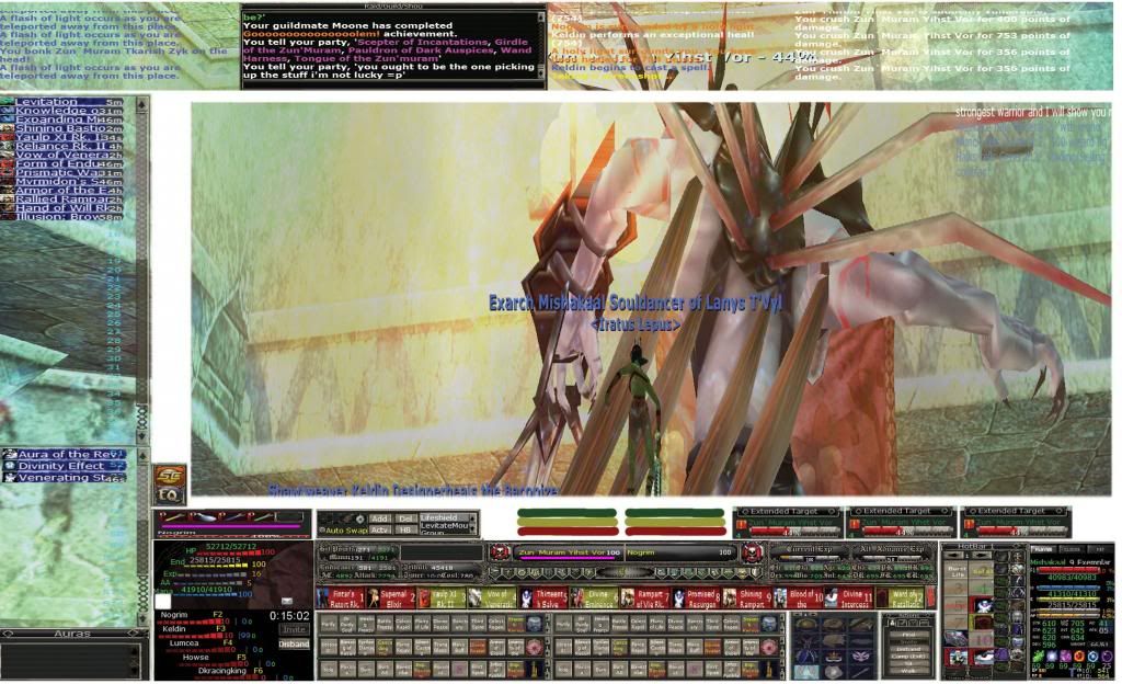
- Text string too short to display properly the information in each window. Mostly digits and names in character inventory, character sheets, pet windows and selector windows.
- Interface text display is not shown always in the right place.
- Health on target and target's target would be better if shown with colors in
- Right-clicking hotkeys to edit them freezes the game and the UI until ESC is pressed to cancel making it impossible to edit them.
- In the group window, energy/endurance not showing at all for the group members.
- In the player window, status in combat / out of combat is shown on top of the mana. Whereas it was shown in the target and target's target square.
- Spell icons for buffs are too small, spell names not shown entirely with digits for duration being off and cut in half.
- Potions are not clickable or usable from potion belt.
- Overall, hp, percentages, stats and clickies would need to be fixed please.

* *
I will write down suggestions and ideas to improve it and solve problems.
-/ Make the windows more resizable
-/ Add a longer/larger text field suitable for the window or piece but allowing everything be to shown without cut in half or too cropped in space.
-/ There should be a casting time bar active in the target's bar ( kinda on top) with pink color showing over the health what the spell casting time progress is at and monitor when it will land.
-/ Spellbar a bit bigger showing the spell names entirely or correctly to make them more readable.
-/ Targeting, spells and buffs, group window and player window are critical to be readable an instant and viable for a healer to completely analyzes and make the right move when it counts. Reaction time for a player is based on what they see but mine is screwed up because I cannot find things properly this instant i need to. Still searching information on screen.
-/ Make the buff window resizable and adapt with text string properly showing in full names of the buffs and spell names, also showing timer left on them. They need to be aligned and have enough space to show.
-/
-/
-/
Debug pictures
I hope all i am writing and reporting helps. I'm not very experienced with photoshop. This is just a sketch of ideas of what it could look like.
https://www.dropbox.com/s/b0oj1n9yn977ez7/EQUIdebug.psd
Thanks,
Misha


